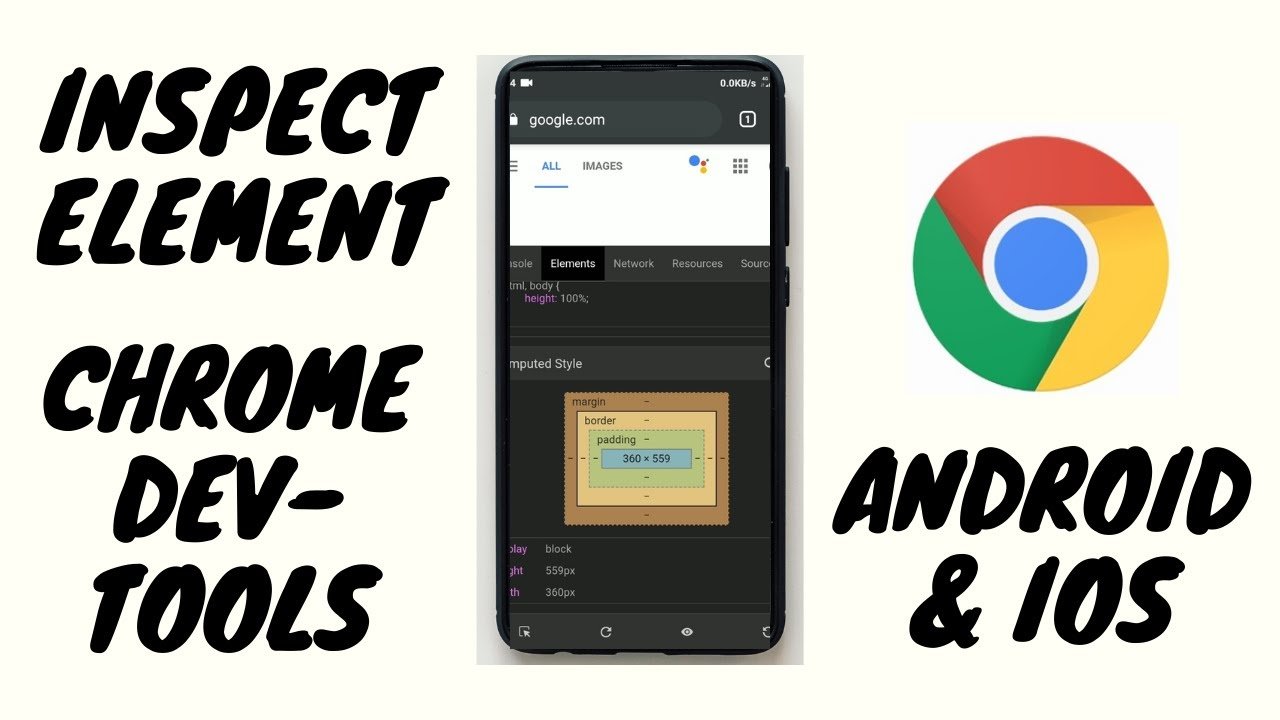
Knowing Inspect on Mobile is crucial in today’s digital world. This skill helps developers and designers ensure websites look good and work well on various mobile platforms.
As mobile internet usage skyrockets, optimizing sites for these devices has become essential. This guide dives into the techniques for mobile inspection, highlighting tools and methods to check and improve website performance, functionality, and accessibility.
From using built-in browser tools to remote debugging and third-party applications, we’ll cover the essentials to make websites mobile-friendly, enhancing user experience across all devices.
Inspect on Mobile
It is essential for anyone who wants to test his web pages on mobiles to be able to inspect them. Since many people use their mobile devices more than their PCs to browse the internet, ensuring they have great experiences while trying your website with those gadgets is critical.
This tutorial will provide insights on directly analyzing and modifying any element in your website using a mobile device. Our primary focus, therefore, will be on examining browser built-in tools, remote debugging, and third-party applications for you to gain skills needed to make your website watchable and used with ease on small screens, thus making it accessible across different platforms and enhancing user experience in general.
The above information shows what is required of one to know how well the websites they own perform flawlessly when their users access them through smartphones or tablets.
The Importance of Mobile Inspection
-
Why It Matters
Knowing how to inspect the parts of mobile gadgets goes beyond mere technicality; it’s a must-have skill for designers of websites targeting mobile audiences. Smartphones and tablets characterize our time; hence, a website should look decent and work properly on mobile devices rather than just being functional.
This wisdom empowers builders to scale up their platforms and make them more user-friendly. It’s about making sure that any visit to the site, regardless of location or method of entry, is consistent with what the users demand, thus underlining the significance of mobile optimization in today’s digital environment.

Step by Step: How to Inspect on Mobile
-
Step 1: Using Browser Tools
Leveraging browser tools for mobile inspection is a straightforward method to enhance website design and functionality. These built-in features allow users to delve into web elements directly from their mobile devices.
This process simplifies identifying and solving design or performance issues, ensuring websites look great and operate efficiently on mobile.
It’s the first step in mobile optimization, making web development more accessible and websites more user-friendly without needing advanced technical skills or external software.
-
Step 2: Remote Debugging
The mobile device is remotely debugged on a desktop computer, allowing web pages to be analyzed and troubleshot further. This technique helps the developers access and manipulate web elements at runtime so they can understand how the website looks on mobile devices.
It is beneficial for complex problem identification performance optimization and ensures a user-friendly interface across various platforms.
By offering detailed action plans rather than simple observations, remote debugging bridges the gap between them and turns it into making particular decisions, thus enabling more precise and faster mobile web development.
-
Step 3: Third-Party Apps
Third-party applications enhance mobile inspections for internet components beyond what browser tools provide. These apps come with unique features that aid in deep analysis and troubleshooting, helping developers optimize their sites for perfect mobility only.
They complement in-house tools because they give users different chances of testing and further improving experiences.
Developers who want to experience a wide range of problems when designing functional websites that operate from any gadget will find this tool indispensable while working on such projects.

Advanced Mobile Inspection Tips
-
Boosting Performance
The mobile inspection process, aimed at boosting performance, involves scrutinizing and optimizing web elements to ensure fast, responsive interactions on mobile devices. This is important in improving user satisfaction because it affects loading times and the smoothness of surfing a site.
Minimizing file sizes, optimizing images, and streamlining code, among other methods, are essential in this improvement process.
By focusing on performance, developers can significantly reduce bounce rates and improve overall engagement, making the website more attractive and functional for mobile users. Performance commitment is crucial in this digital marketplace.
-
Mobile Accessibility
Creating inclusive digital experiences necessitates ensuring accessibility on mobile devices. This is about modifying web elements for all users to be easily navigable and understandable, even by people with disabilities.
Readable fonts, sufficient contrast, or screen reader support should be integrated during the delivery of this program. Ensuring websites are accessible through mobiles improves usability, promoting equality in digital access.
It isn’t just about legal obligations but accepting these users’ diversity so that a seamless online experience captivates them despite their physical limitations.
Wrapping It Up
Getting a handle on how to inspect on mobile is invaluable in today’s centric world. Moreover, this guide has thoroughly explored the methods and tools for mobile inspection, from browser-integrated features to remote debugging.
By employing these techniques, web developers and designers can boost the functionality, performance, and accessibility of their sites. Consequently, this ensures a top-notch user experience on all mobile devices.


